Designing the system behind Reevv Research
Building a visual language that could move seamlessly between Reevv's products, interfaces, presentations, and marketing.
In September 2024, I spent eight weeks building the visual identity and brand system for Reevv, an AI-native operating company. The work covered everything from the core identity to how it could stretch across the products Reevv was building.
Reevv wasn't building just one product. It was building an operating system for solo operators, a realty automation tool, a fact-checking product, and more. The challenge was creating one identity that could connect all of them without making everything look the same.
Before opening Figma, I spent time with Joshua Jack and Christian Reyes, the co-founders, talking through what they wanted Reevv to feel like and where they wanted the company to go. That conversation gave me a much clearer direction before I started exploring the visual side.
I started by looking at how AI companies were presenting themselves and, more importantly, where Reevv could feel different. I explored a range of typography, symbols, layouts, and logo directions before narrowing things down.
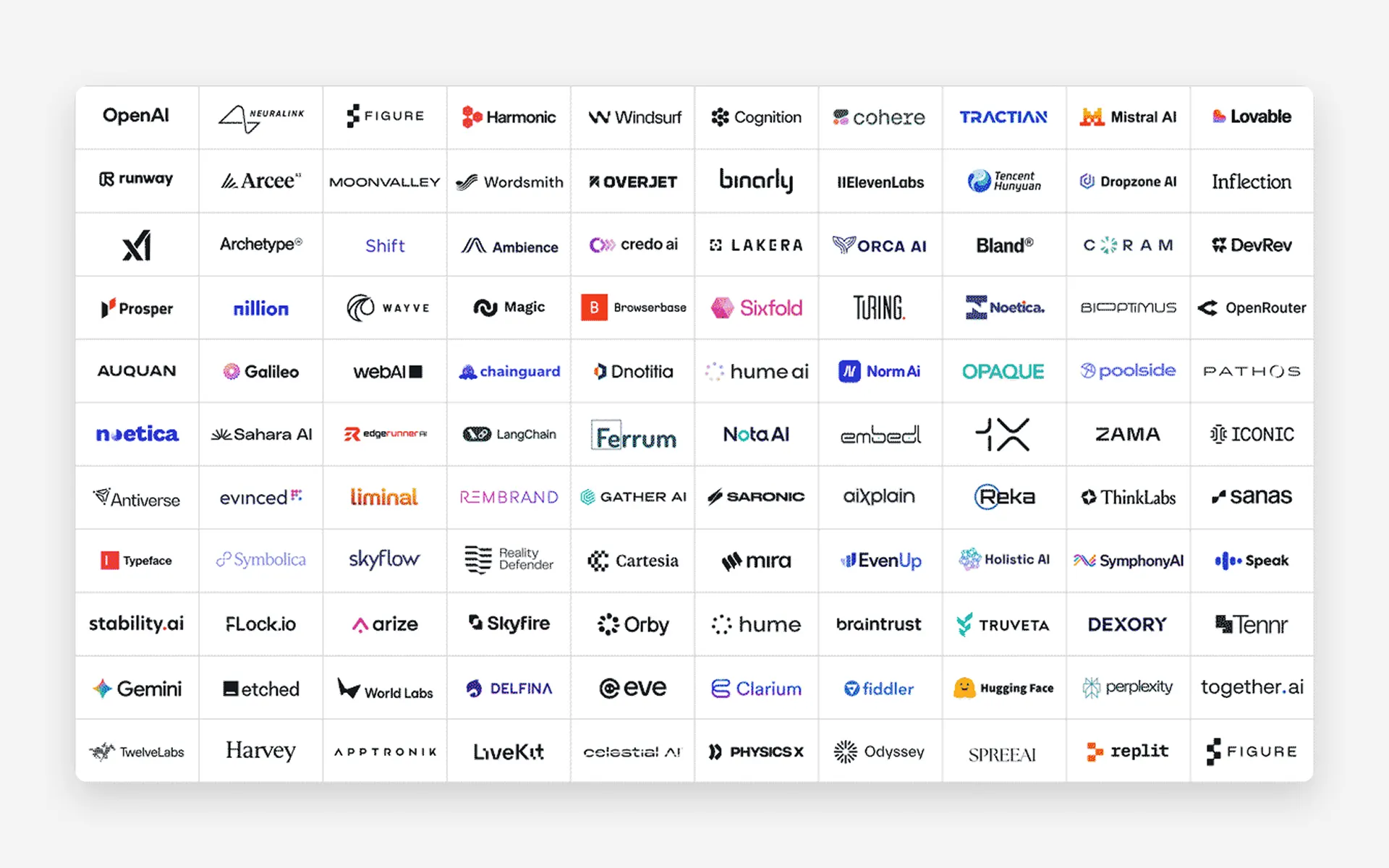
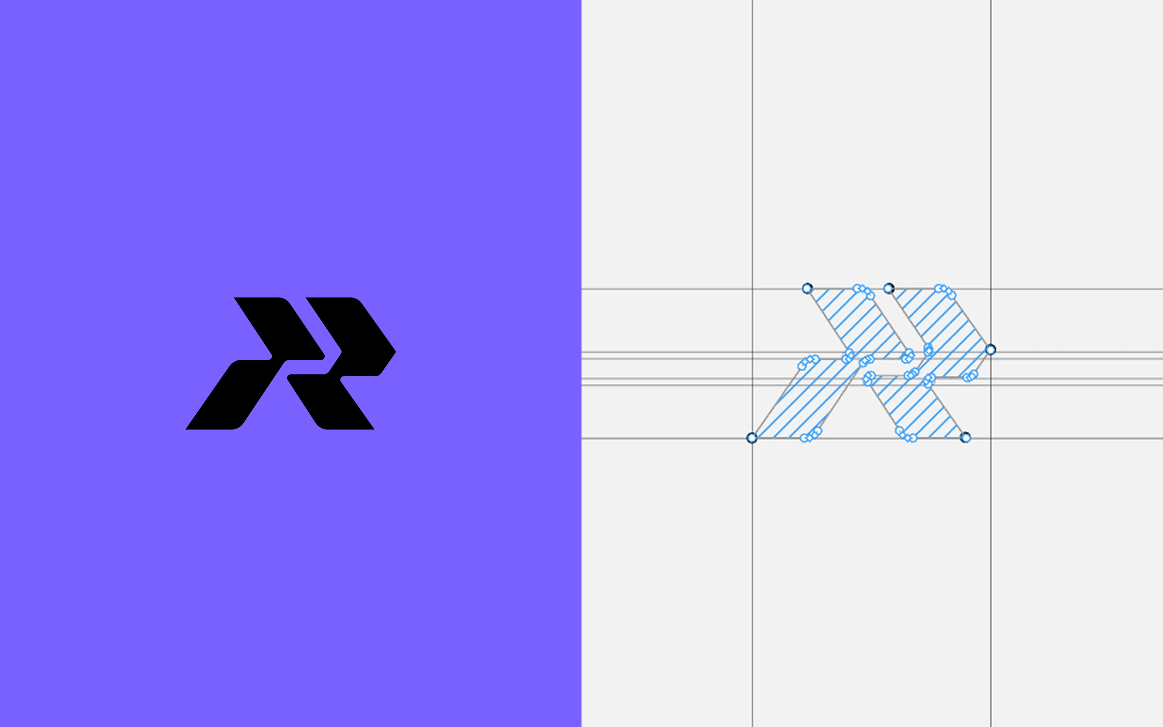
The logo went through quite a few iterations. With each round, I stripped a little more away until it became something simple enough to recognize, but flexible enough to work across a product, a presentation, or a business card.
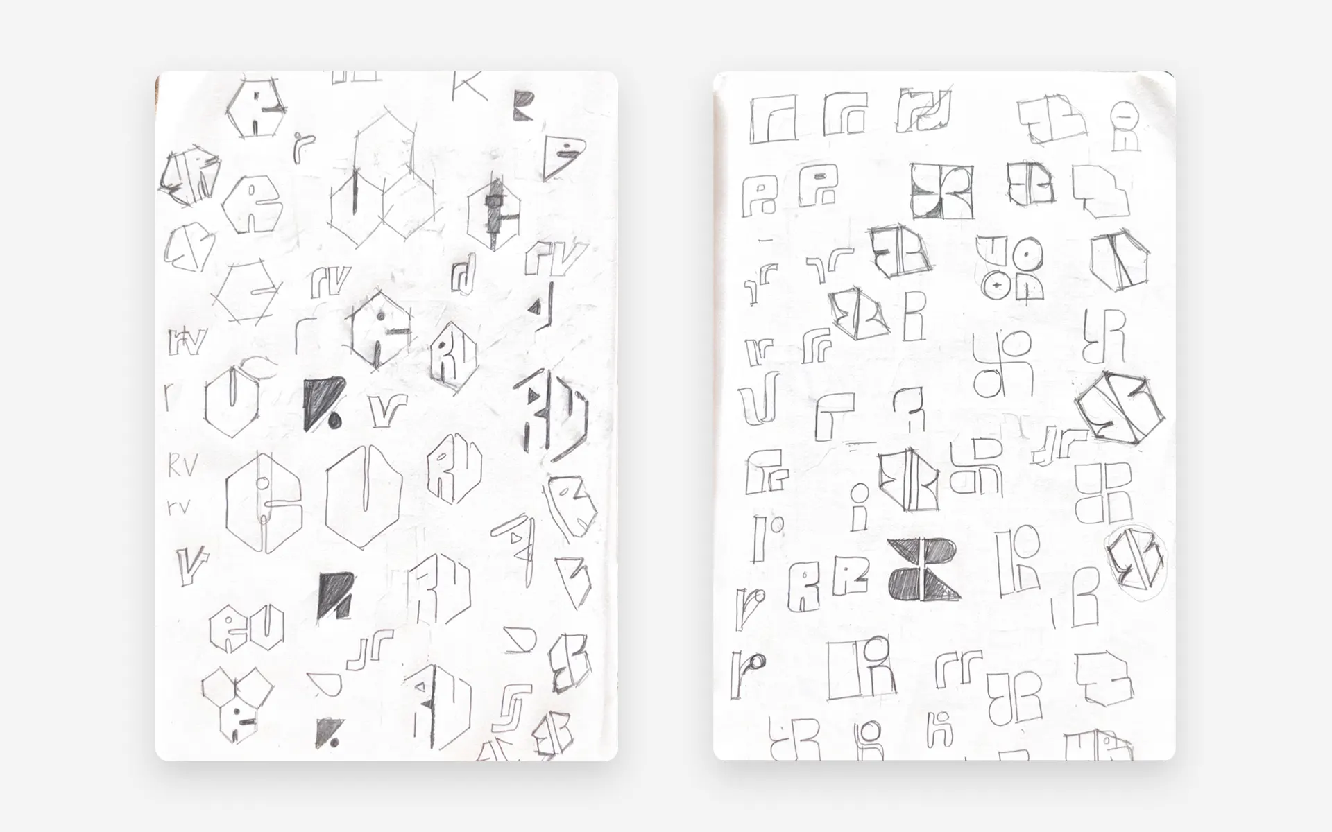
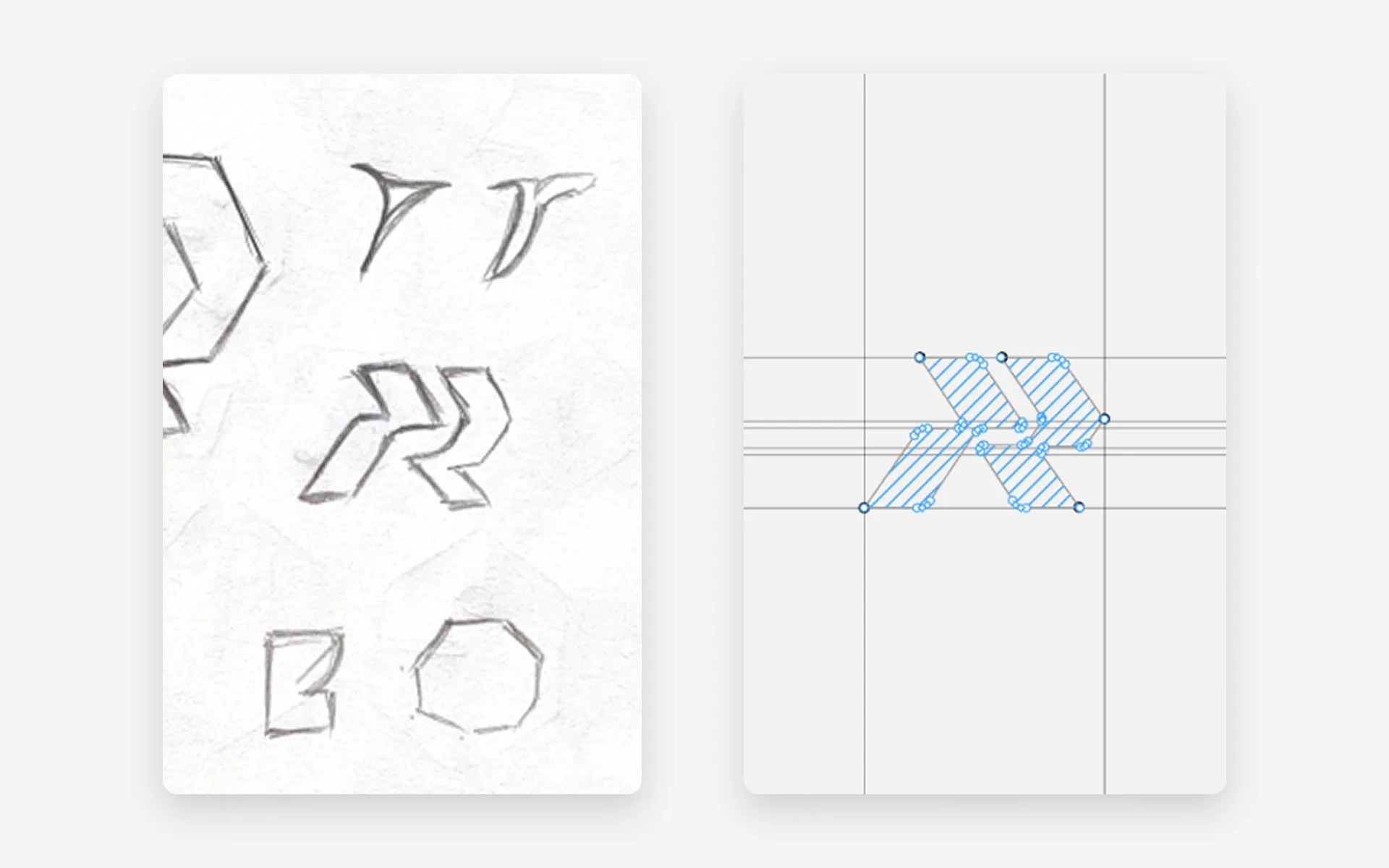
After several rounds of exploration, we landed on this direction and refined it to feel more focused, distinctive, and aligned with Reevv's positioning.
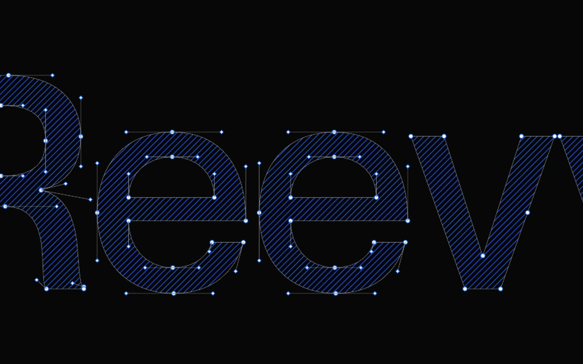
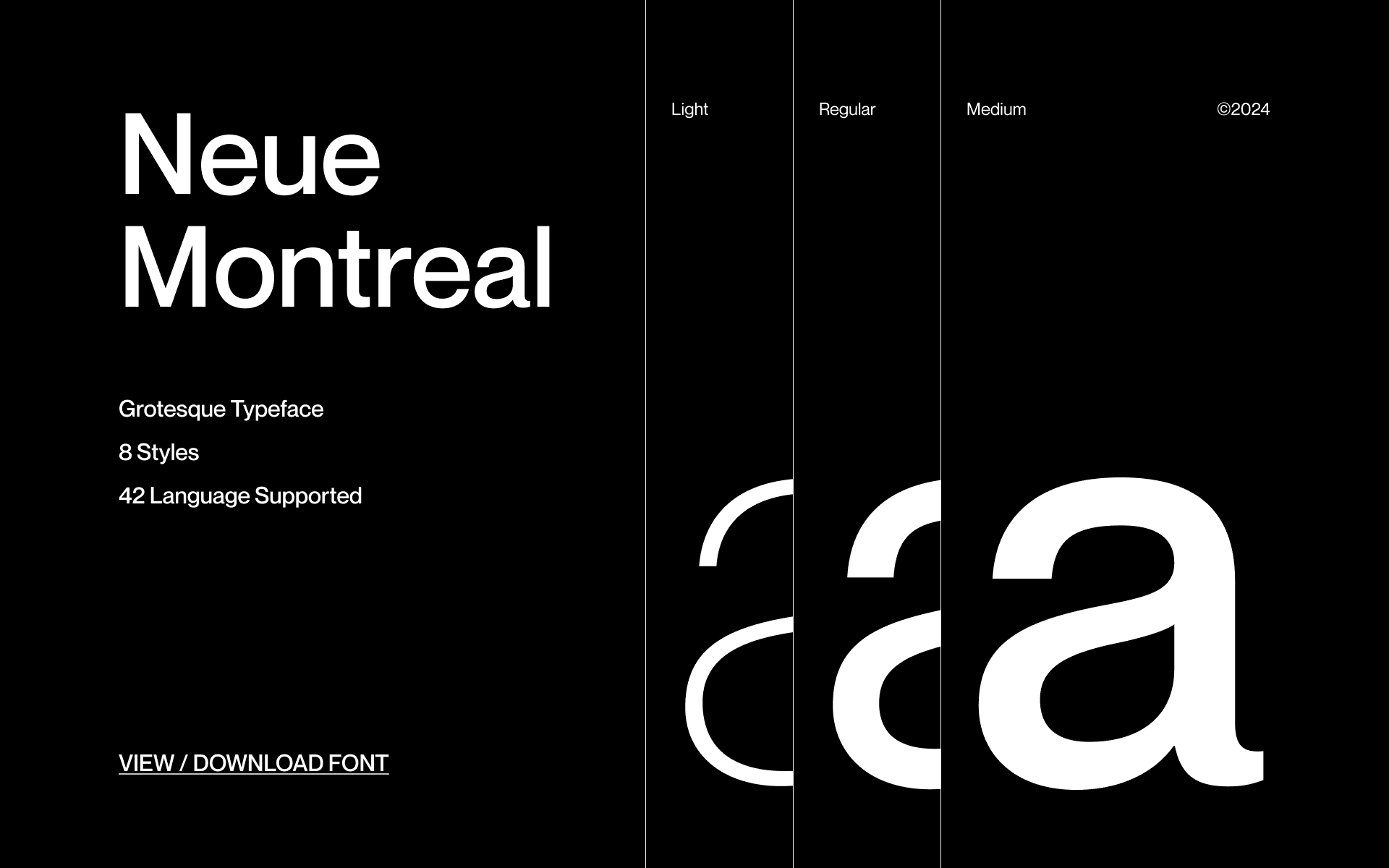
Typography became a big part of the identity. I wanted something that felt technical and precise, but still had enough character to work outside of the product.
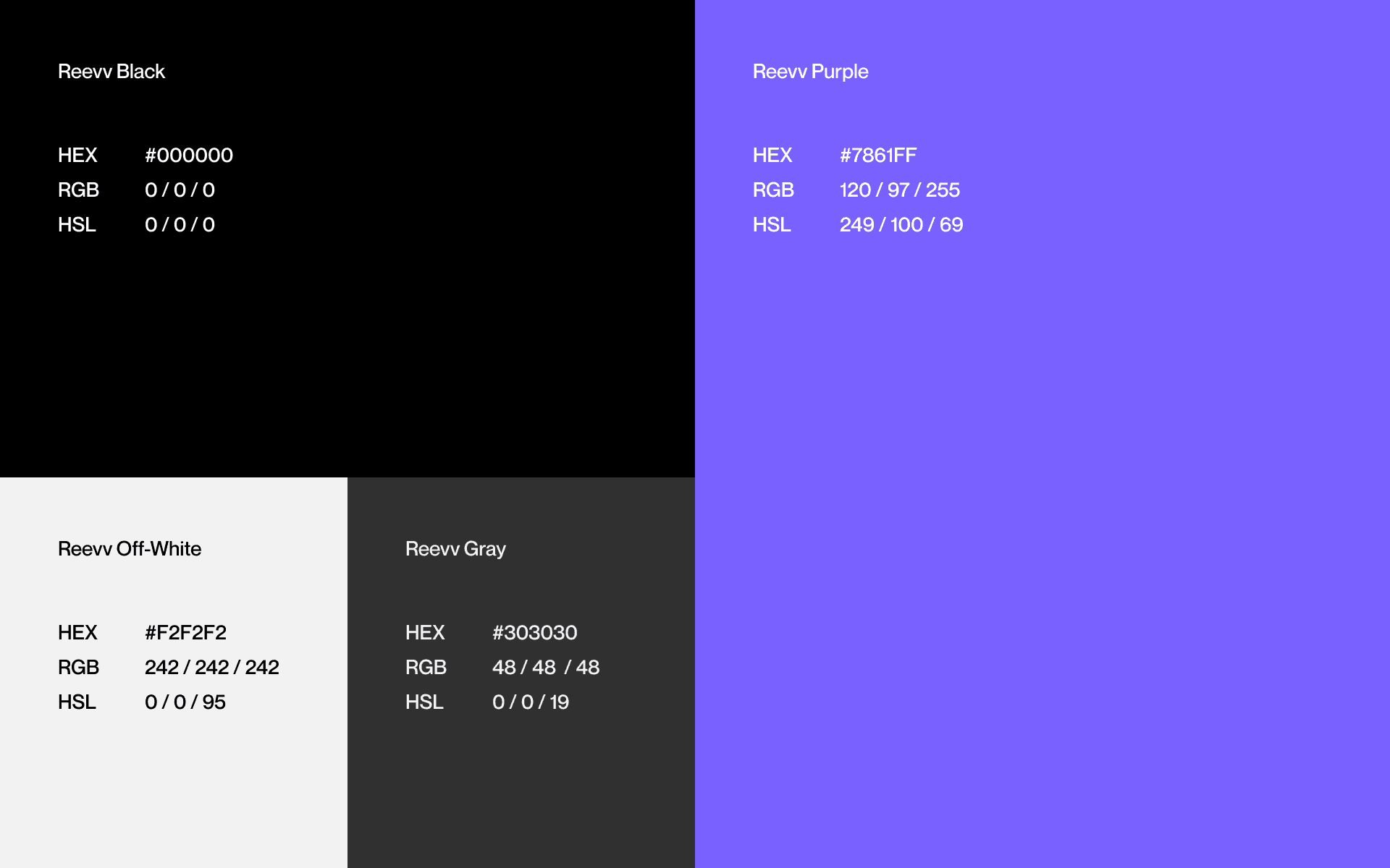
The colour palette stayed intentionally small too. Keeping it restrained made the system easier to recognize and gave each product enough room to have its own personality without drifting away from Reevv.
Once the visual direction was established, I started turning it into a system — typography, spacing, colour, components, and the smaller rules that keep everything consistent.
I then applied it across product interfaces, presentations, and marketing materials to make sure it worked beyond the brand itself.
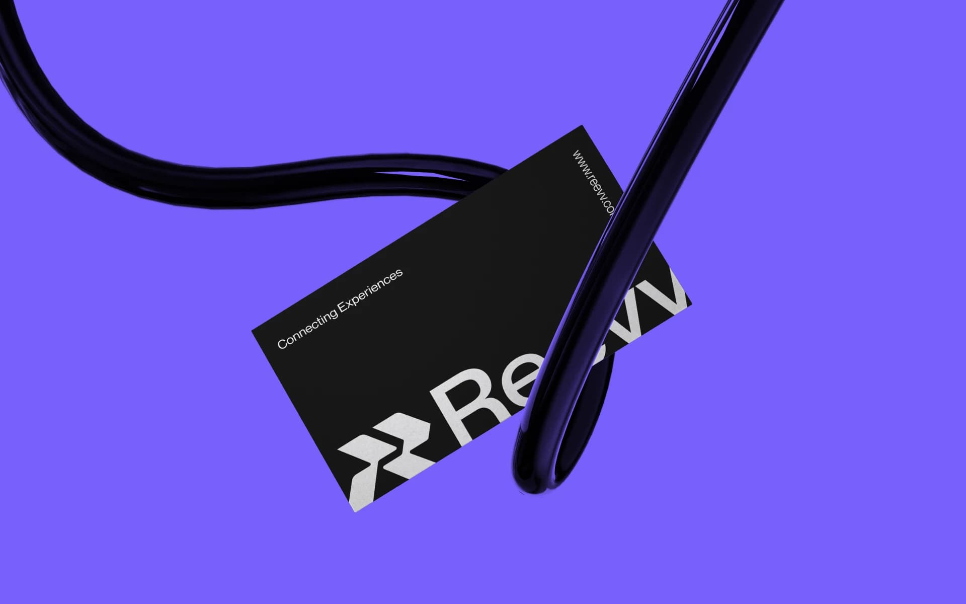
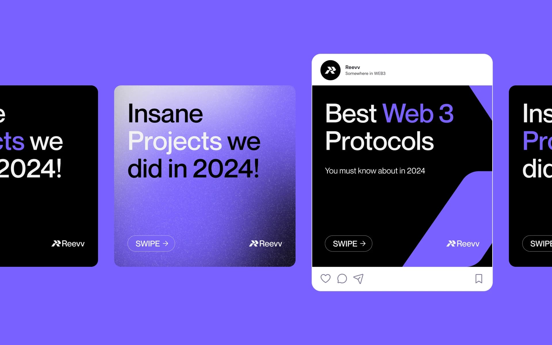
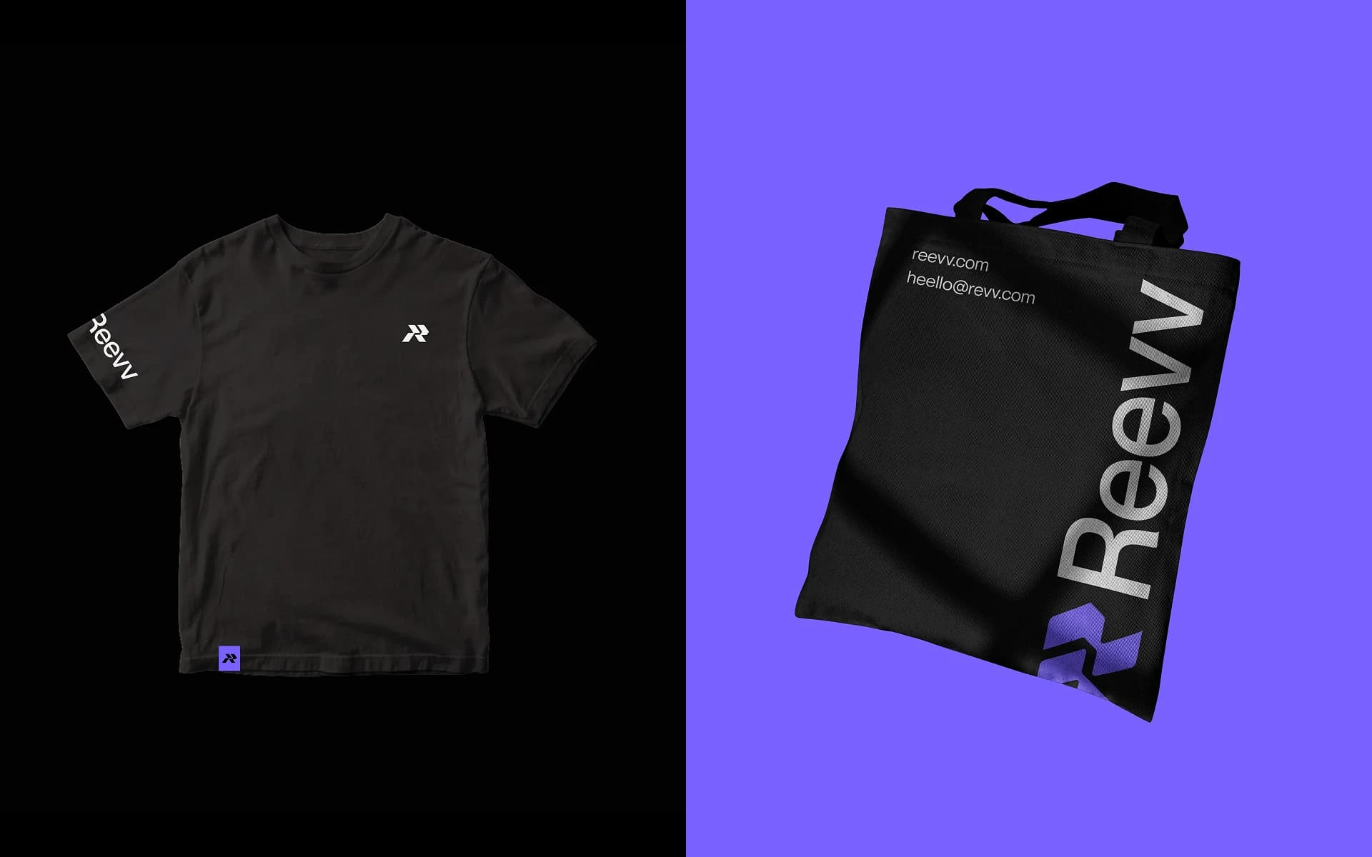
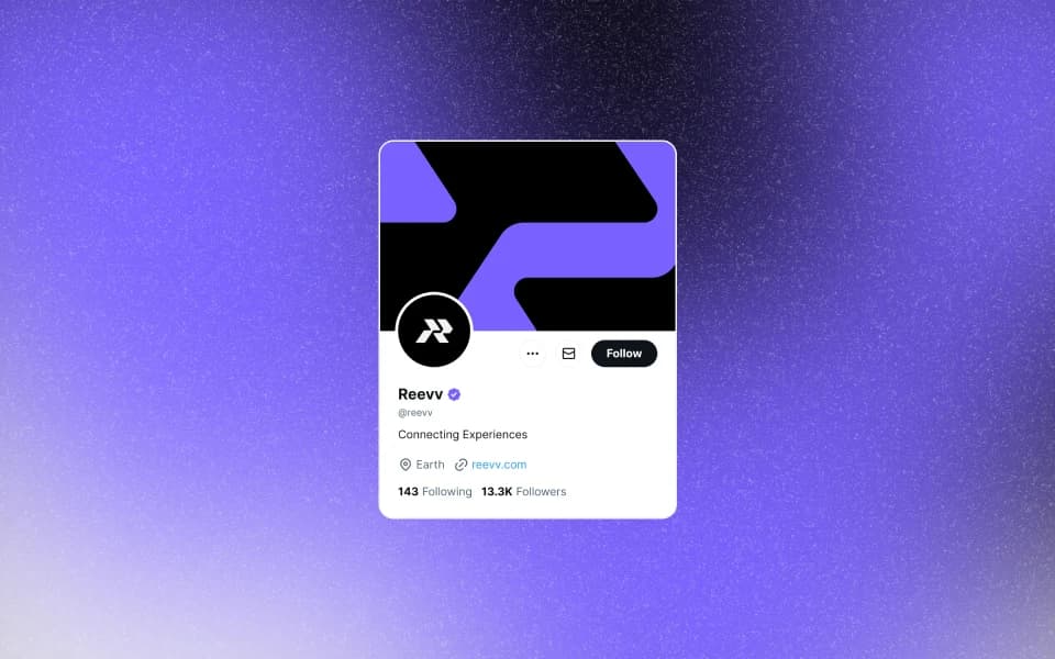
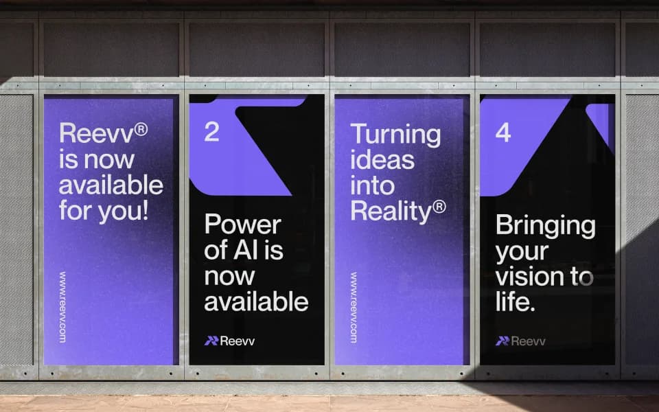
The identity now extends across Reevv, giving everything the company builds a shared visual language while leaving room for it to evolve.
Different products, but one recognisable system tying them together.